
How do our teachers’ CLASS scores compare to each other and the national average?
ABC Head Start wanted to conduct a thorough evaluation of teacher performance using the CLASS evaluation tool. They wanted to make sure all instructors were meeting performance standards and offer resources and training to any needing improvement. Using visualized data allowed the program to quickly identify how well each instructor performed in relation to her peers as well as national standards.
Previously, the program did not compare instructor’s performance against each other or the national standard and did not use visualization to help with analysis. Using data visualization revealed a number of interesting patterns that allowed the program to improve their performance.
(*ABC Head Start is a generic name we use in the Playbook when a program does not wish to be identified.)
ANALYSIS
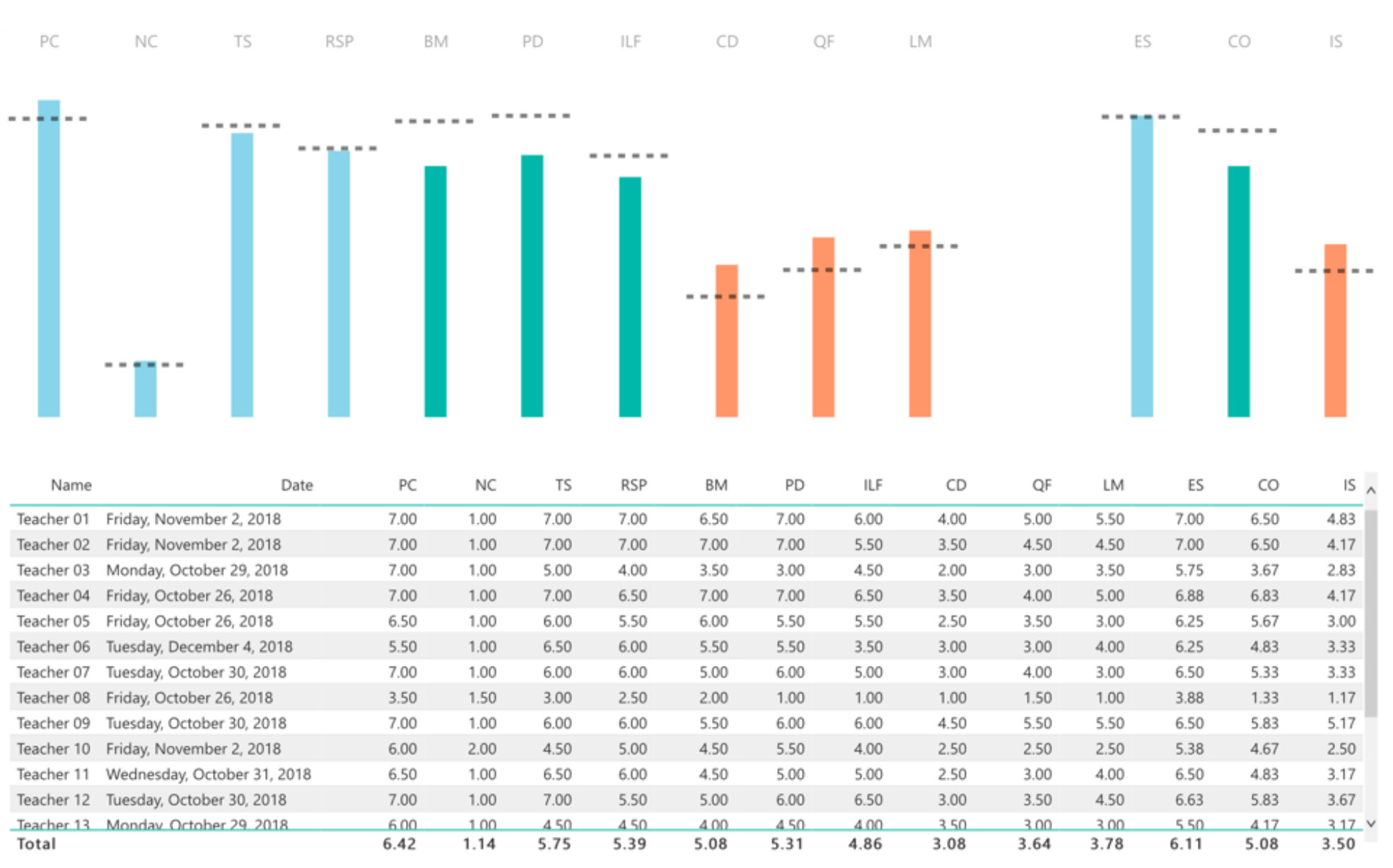
In order to visualize CLASS data in this manner, ABC Head Start exported the data from Teachstone’s software as a csv file and uploaded into DataSay. The DataSay system converts the raw, flat data into the visualizations seen below so that the program can analyze scores on each dimension of the CLASS assessment. In chart 1 below, each colored bar shows the program’s average score on a dimension or domain (with the abbreviations across the top) and the horizontal dotted line is the national average for each dimension or domain. The numbered scores from each evaluation, and the overall program average, is also shown in the bottom half of the screen.

Chart 1: Program Performance vs. National Average
Just by comparing whether the bar falls below, just reaches, or goes above the dotted line, ABC Head Start can easily pull out the areas where they are high-performing and areas where they need to improve.
In addition to looking at the program’s average scores, ABC Head Start is able to look at each individual teacher’s scores as well. By clicking on one teacher, the dashboard changes to highlight that teacher’s scores in the heavy color, while continuing to show the program average in a faded color so that the teacher can be compared to both the national average and the program average. The two charts below (Chart 2 and Chart 3) show this dashboard highlighting the individual scores of two different teachers – one consistently performing under the program average and one performing consistently above.

Chart 2: Teacher 03 Performance vs. Program Performance and National Average

Chart 3: Teacher 12 Performance vs. Program Performance and National Average
RESULT
Reviewing the visualized data in Chart 1 provided the management team with a significant amount of information around how their program performed compared to their peers nationwide. The management team validated that the vast majority of their teachers performed at or above the national standard in each of the dimensions listed and identified those teachers needing additional training and resources.
By using the information provided in Chart 2 and Chart 3, the management team was also able to identify high-performing teachers and engage them in a discussion about their teaching strategies. ABC Head Start is now using those strategies throughout the program to hopefully improve their overall scores. They will monitor the data over the next program year to see if their new approach of providing resources and having high performing teachers train their peers has a positive effect on individual teacher performance and boosts their scores relative to the national average.
ADDITIONAL DETAILS
AUDIENCE: Management, Leadership
LEVEL OF ANALYSIS: Teacher
DIFFICULTY: Moderate
CONTENT AREA: Classroom Assessment
DATA SOURCES: . DataSay, CLASS
TECHNICAL APPENDIX
ABC Head Start exported the data from Teachstone’s software as a csv file and uploaded into DataSay.
Interested in another way to analyze this data? Check out another use case on the same topic.
Questions about this use case? Email them to analytics@nhsa.org and we’ll get in touch with the author for you!